Monday, April 22, 2019

FINAL ROUGH CUT 8

 ...

(JC)What I have changed since the last rough cut:

1. Stabilisation of shots
2. Cross cutting between stair shot at the end
3. Zoom out transitions on drops
4. Added takes to make shots more dynamic and help verisimilitude
5. Removed blurry footage of digger 
6. Moved beginning of some shots to the end of a lyric 
7. Slomo added on most narrative 
8. Added more performance to break up narrative 
9. Color corrected graveyard scene to be black and white 
10. Moved small sections of layering or removed it 
11. Made section where the lead singer joins girl at grave longer to make a larger impact on audience 


(CS)Corrections to be made:
...

  • Few tweaks to editing
  • A few shots off pace
  • Lip syncing and syncing up
...

Sunday, April 21, 2019

DIGIPAK: Draft 3

Cover
...

...

Changes:

  • Added 3 tracks
  • 2 live tracks + 1 acoustic for Deluxe Edition 
  • Changed Deluxe Edition sticker (specific on live tracks + acoustic) 
    • Have "Deluxe Edition" Written on the outside 

Saturday, April 20, 2019

Monday, April 15, 2019

DIGIPAK: Draft 2


This is the second draft after more research on digipaks
Things that changed:

  • sticker has been updated
  • back cover switched 
  • barcode changed location
  • copyright statement is actually real and not random
  • qr code + website 
  • formating 
  • inside cover has become just band 

ROUGH CUT 6

...

...

Things to improve:

  • Abandoned building shots a bit too shaky
  • Lip syncing off in various different places (takes away from verisimilitude) 
  • Have the final shot last for 2 more seconds to anchor who it is properly and let people gasp
    • Maybe add in dietetic footsteps and wind noise + birds? (diegetic outro)

Sunday, April 14, 2019

WEBSITE: Tour of Website

...

...

Tour of the website explaining how it works and why we have put certain things where they are.

Merch store still needs to be improved.

ROUGH CUT 5

...

...

What we have improved:

  • Even more syncing up
  • removing the little drumming sequence as it didn't work
  • added and removed a few shots

Wednesday, April 10, 2019

DIGIPAK: Draft 1

Video Explaining Digipak
...
...
Digipak with CD 
...

...
Digipak without CD
...
...

DIGIPAK: Research

I looked at three different digipaks, two from the indie genre and one from a pop genre to see the contrast and tried to notice common conventions and distinctive features on each.


Front Cover
...
Kasabian Empire (Indie)

Pixies Indie Cindy (Indie) 

Sam Smith In The Lonely Hour (Pop)
The three front covers I looked at, these are the common conventions:
  • Front Cover image/design 
  • Band name + Album title
  • Parental Advisory Sticker (if needed) 
  • Stickers to highlight special edition or limited edition explaing whats in it
Not much different rather than a striking image on all of them which the audience will recognise. Also increases chances of being noticed in a CD store or another retailer such as US number 1 retailer Walmart.

Possible Influences
Sticker with limited edition
Striking cover

Back Cover
...
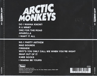
Ariana Grande Yours Truly (Pop)

Arctic Monkeys AM (Indie) 

Oasis Stop The Clocks (Indie/Pop)
These are the three back covers I looked at. Common Conventions are:

  • Track list
  • Barcode
  • Copyright statement
  • Copyright logos
    • All these will be on our digipak
The recipe is seems very similar just with different art styles, Indie being a bit more subtle sans serif bold font whereas Ariana Grande has a serif bold font and has colour coded where someone is featured. The font is also pink rather than white. Arctic Monkeys and Oasis have also gone for a design as a back cover rather than an image of the band or lead singer etc.

Possible Influences
Track list + copyright statement + barcode and copyright logos + record lable logos

Inside Cover
...
Coldplay Ghost Stories (Soft Rock/Pop)

Depeche Mode Violator (Dance/Indie) 

Metallica, Metallica (Heavy Metal)
 There are a few common conventions I can spot here but each seems to have a small difference.

  • Copyright logos
  • Compact disc logo
  • Band name on CD + Album Name
  • Tracklist on CD
  • Blank or minimal inside cover
I also noticed that Metallica has the track list on the inside as well as on the CD where Coldplay has the copyright statement on the CD and Depeche mode has both the copyright statement and tracklist. Depeche Mode inside cover on the left has the record company name and a P.O box for fans "Depeche Mode fanclub".

Possible influences
I think we might go for a minimalist design, maybe with the band being part of the both sides.

Spine
...
Queen Greatest Hits ll (Classic Rock)
David Bowie Changesbowie (Dance/Pop)
AQUA Aquarium (Electro/Dance)
Common conventions:
  • Band name/logo
  • Album Title
  • Serial Number (with letters) 
  • Mainly formatted album title in middle with band name a bit to the left
There is also a universal logo for aqua album 

Possible  Influences
We will have both band name + album title and serial number, maybe even the band logo

Tuesday, April 9, 2019

ROUGH CUT 4

...

...

What has been improved:


  • Included fight scene in both slo motion and real time
  • updated the funeral scene
  • have another performance location with just lead singer being solo 
  • tweaked a few bits to make it sync up 

DIGIPAK: Album Cover 2

Album Covers
...
Version 1
 ...

Made and album cover update after our photo shoot and have chosen this image alongside changing the album title to "How High". I have played around a bit with the text and have made a grainy version as well as this clean version above. Below is the grainy text version. I will try and get audience feedback and take it from there.
...
Version 2

...
Version 3
...

Audience Feedback

I made a post on the Facebook to try and get audience feedback on which post they font they preferred with a black version of the text as well. 

(black version)

...

...
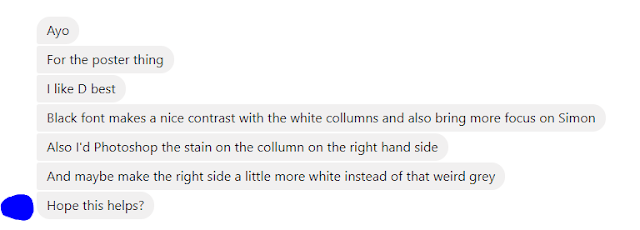
Some of the feedback I received was (names and pictures have been covered for privacy reasons)...
...
...
...

The main responses seem to be catering towards C which is the grainy version 3 above in the post and there also seems to be a positive response to the black and cleaner fonts.