Album Covers
...
Version 1

Made and album cover update after our photo shoot and have chosen this image alongside changing the album title to "How High". I have played around a bit with the text and have made a grainy version as well as this clean version above. Below is the grainy text version. I will try and get audience feedback and take it from there.
...
Version 2

...
Version 3

...
Audience Feedback
I made a post on the Facebook to try and get audience feedback on which post they font they preferred with a black version of the text as well.
(black version)

...

...
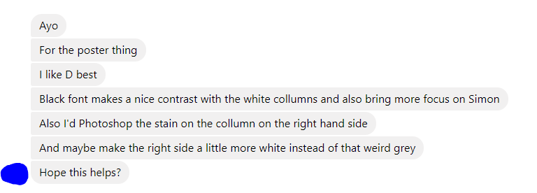
Some of the feedback I received was (names and pictures have been covered for privacy reasons)...
...

...
The main responses seem to be catering towards C which is the grainy version 3 above in the post and there also seems to be a positive response to the black and cleaner fonts.
Maybe too much (equivalent of) white space? Font works, though maybe experiment with greater size. Another option is colouring individual pillars (LGBT+ potential connotation, rainbow flag, suited for generation Z?), or layering onto them. But as long as you include clear Photoshop skills elsewhere cover needn't be complex. Maybe incorporate the green toy from the video? And don't forget a sticker pushing exclusive content on the digipak eh live tracks)
ReplyDelete